And we should consider every day lost on which we have not danced at least once. And we should call every truth false which was not accompanied by at least one laugh. -Friedrich Nietzsche
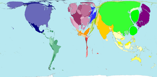
Fascinating. Thanks for showing us this. The visuals really have impact. such a lop-sided world.Lynne
Post a Comment

1 comment:
Fascinating. Thanks for showing us this. The visuals really have impact. such a lop-sided world.
Lynne
Post a Comment